
SUMMIT-TECH
THE BRAND
Summit-Tech is an IT consultancy serving professional services businesses - built on expertise, delivered with a human approach.
THE BRIEF
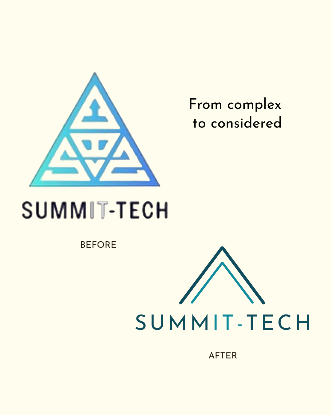
The existing brand felt cluttered and generic - a busy logo that looked like every other IT company. The brief was to modernise it without losing the brand equity built up over time.
SOLUTION
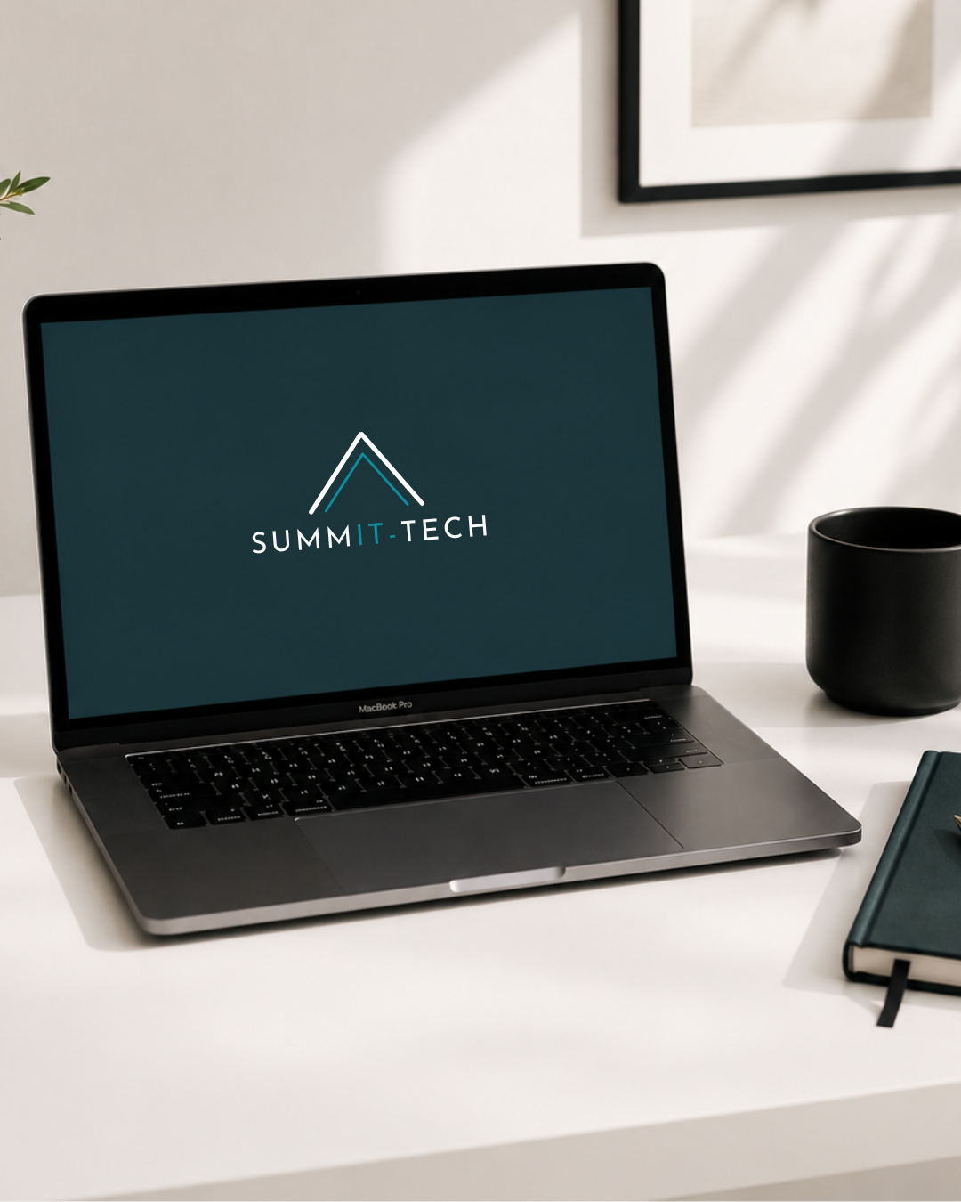
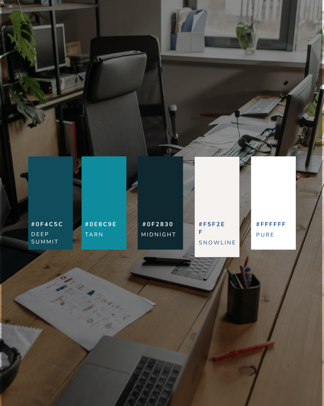
The refresh started with the foundations: a refined peak mark built from two clean lines, carrying two meanings - the outer representing the summit, ambition and progress; the inner, the technology layer that powers it all. Teal sits over blue, Josefin Sans replaces the generic sans serif that came before - familiar enough to trust, distinctive enough to remember.
DELIVERABLES
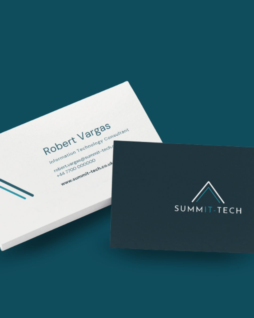
Brand Identity - logo redesign, typography, colour palette