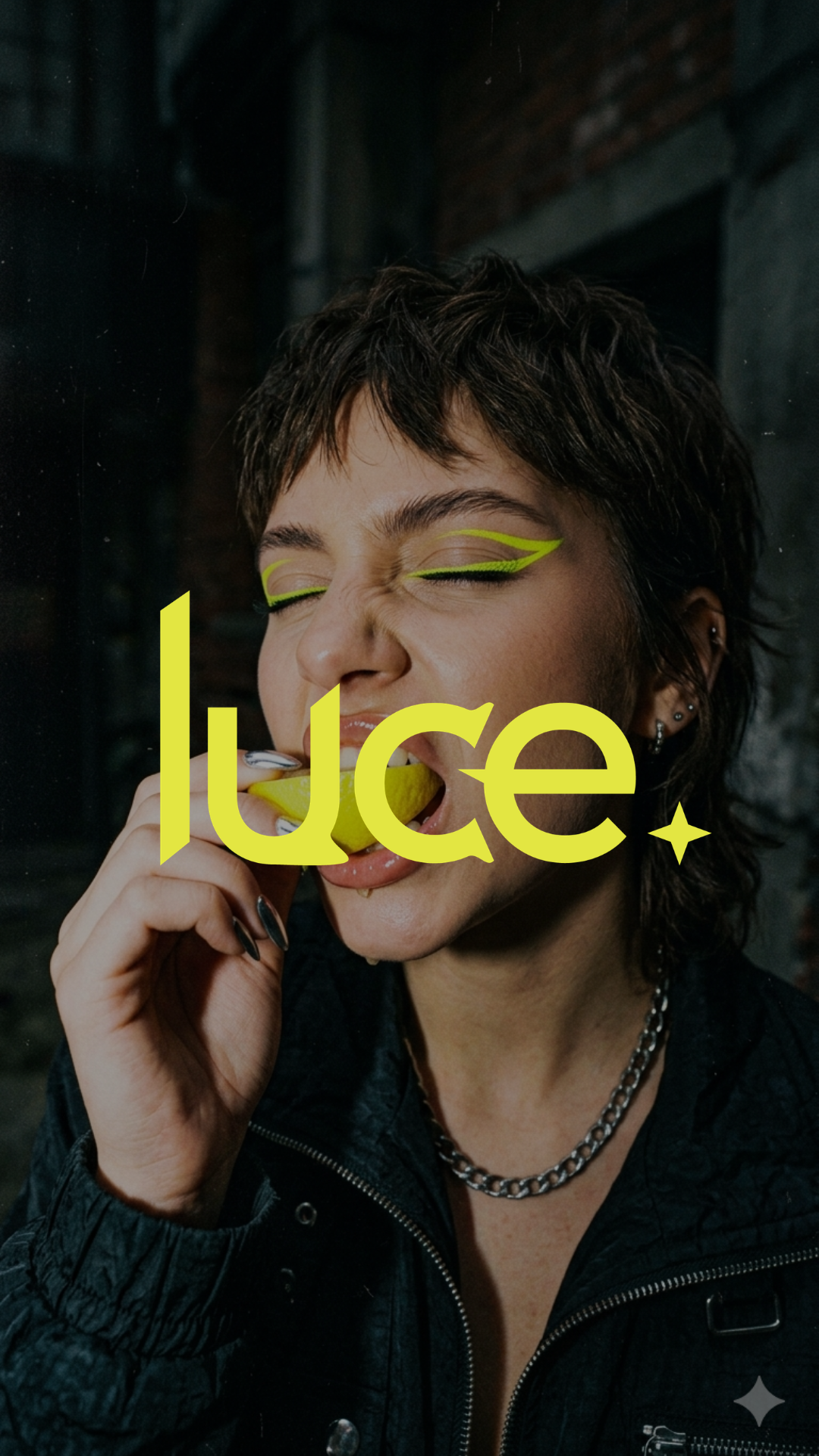
Luce
THE BRAND
Luce is an energy drink brand built for the Gen Z consumer who wants to feel good without compromising on how they look doing it. Three variants, three worlds, one cohesive brand.
THE BRIEF
Most energy drinks on the market lean into aggression - loud graphics, extreme flavours, hyper-masculine branding built for gaming and gym culture. Little has been designed for a consumer who wants the function of an energy drink without sacrificing aesthetic or identity. The brief was to create an energy drink brand that feels as considered as the lifestyle it fits into - one that looks as good in your hand as it makes you feel.
SOLUTION
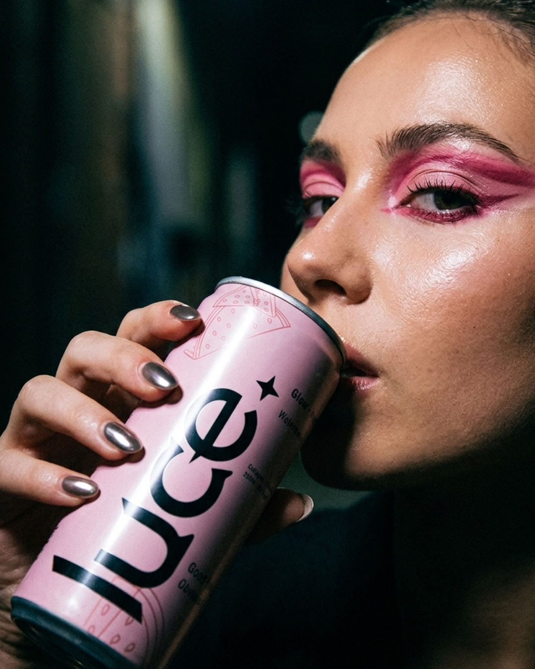
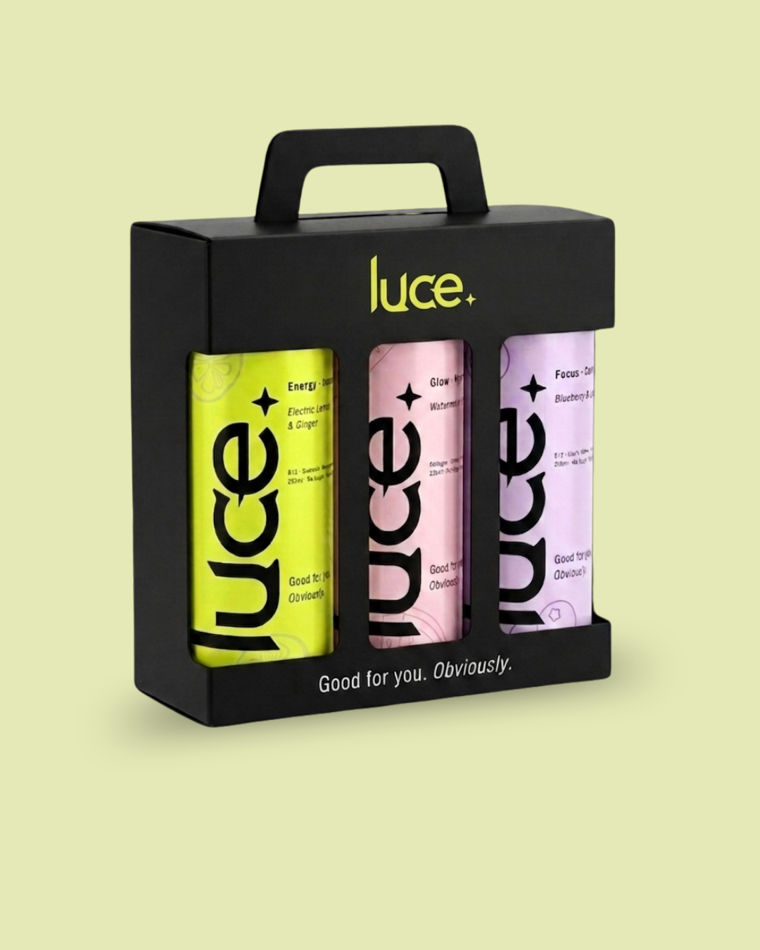
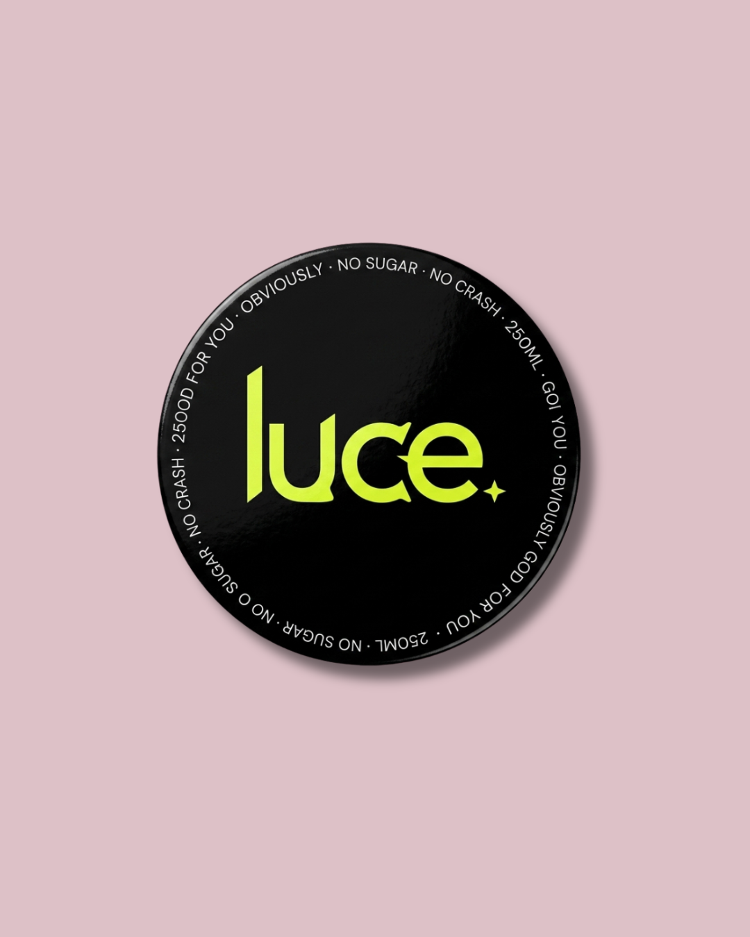
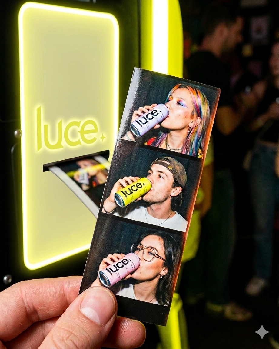
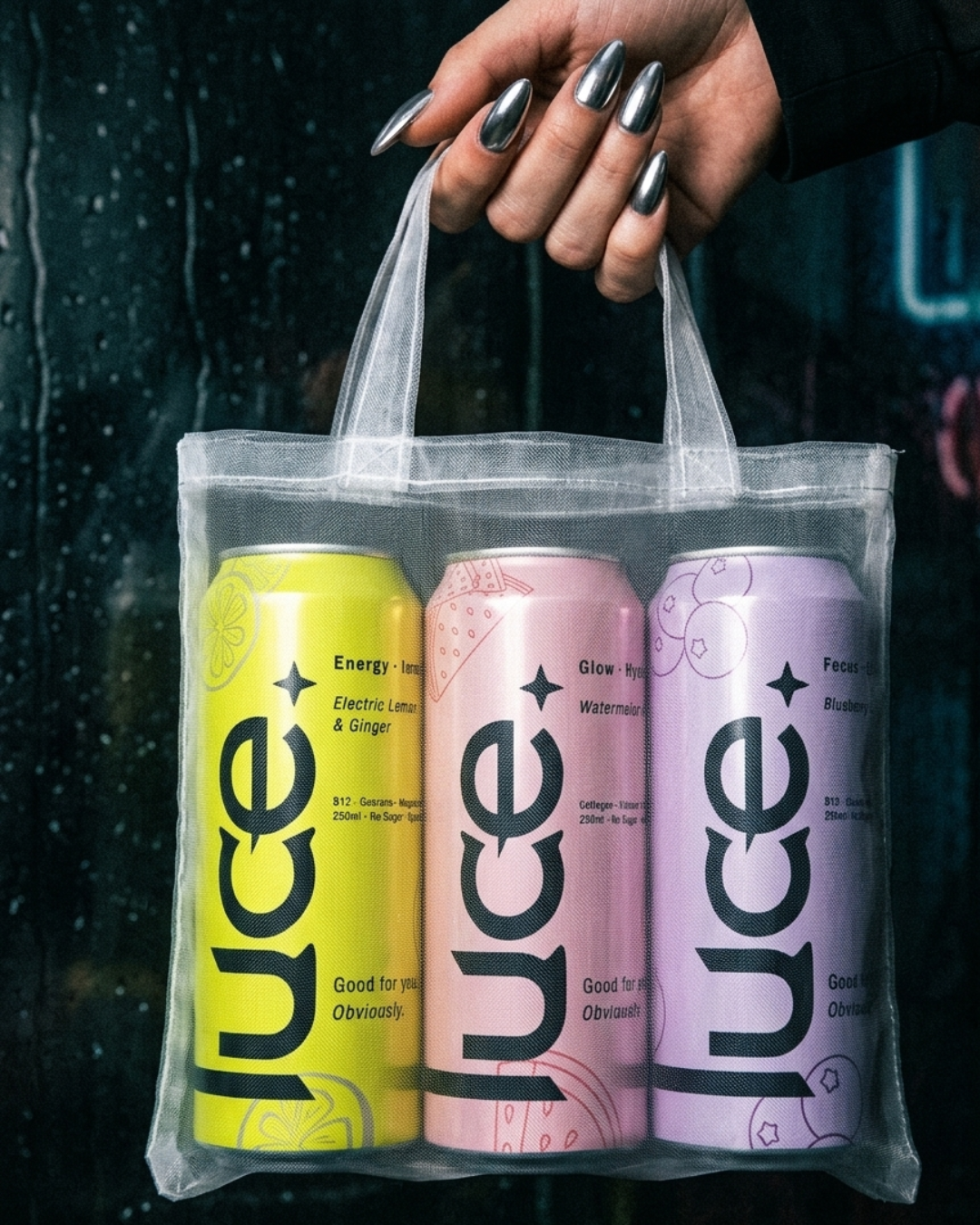
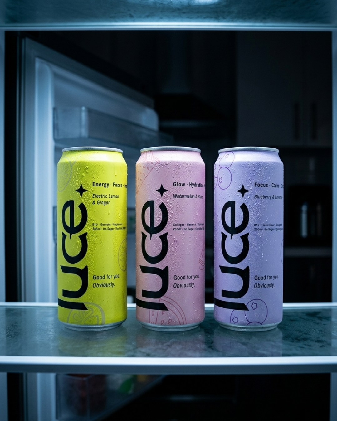
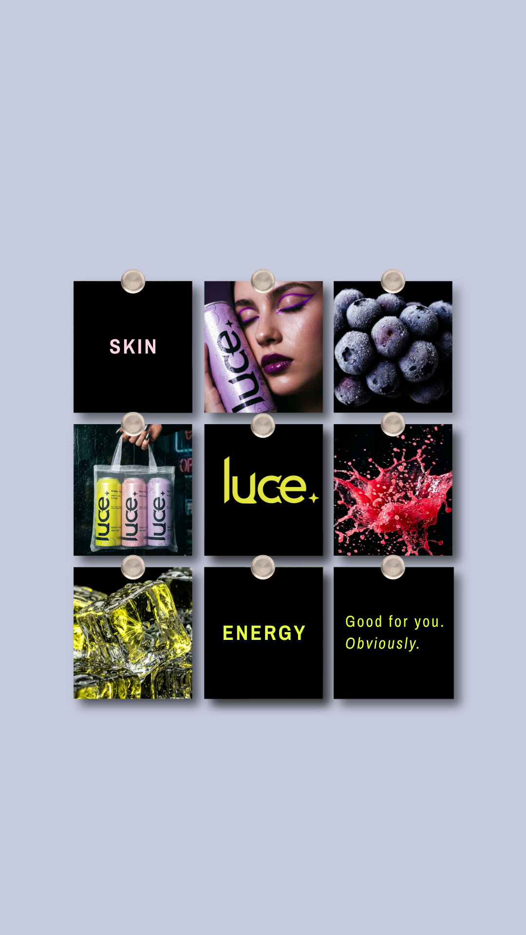
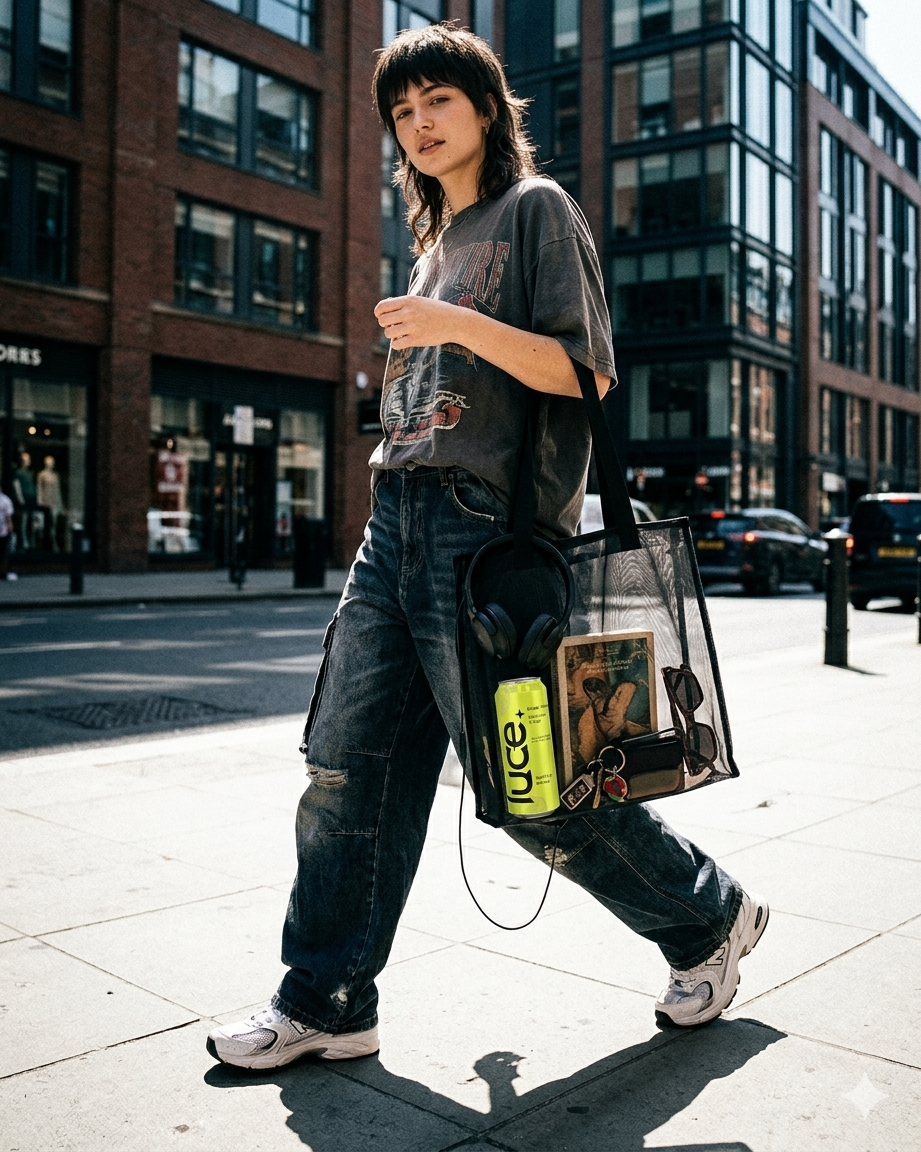
The visual world is built around dark, moody editorial photography - cinematic lifestyle shots, ingredient textures, and in-the-wild moments that place the brand in the real world rather than a studio void. The luce ✦ four-point star runs throughout as the brand mark, tying all three variants together under one cohesive identity despite their distinct colour worlds. Packaging extends beyond the can itself into a carrier box and mesh tote - building out the full brand ecosystem from can to unboxing.
DELIVERABLES
Brand Identity - logo, colour palette
Packaging - can design, carrier box
Creative Direction - lifestyle photography direction