OSMOSIS
THE BRAND
Osmosis is a breathable natural deodorant brand built on one simple principle - your skin needs to breathe.
THE BRIEF
The brief called for a full brand identity for a natural deodorant brand, aimed at health-conscious consumers aged 22-45 who read ingredient labels and are actively moving toward cleaner personal care.
SOLUTION
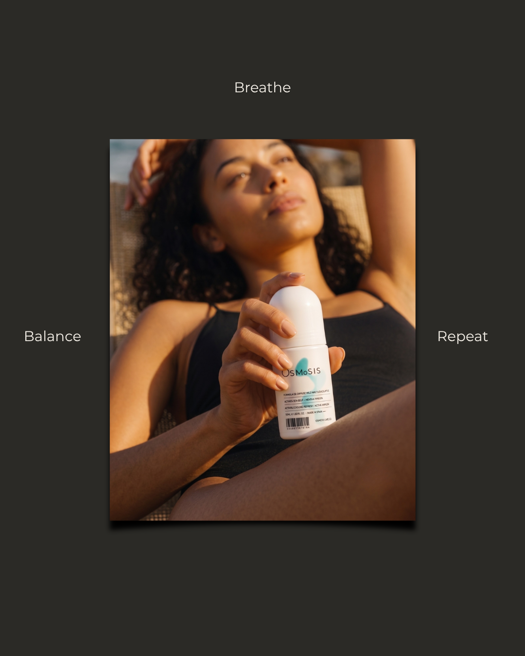
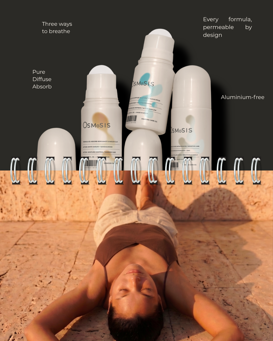
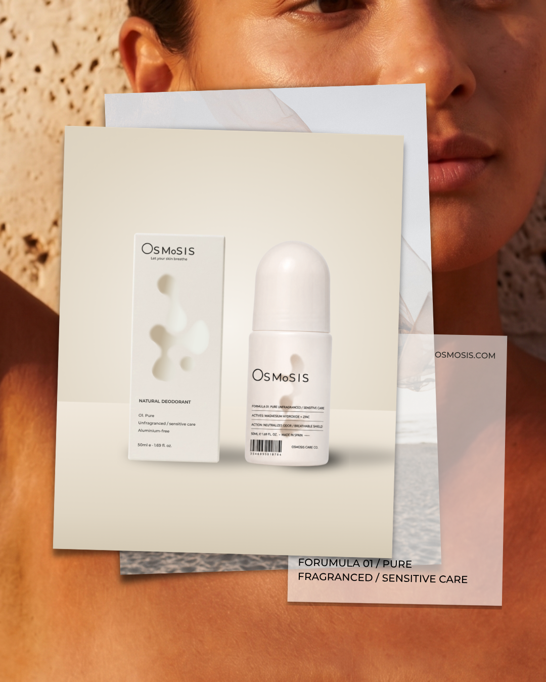
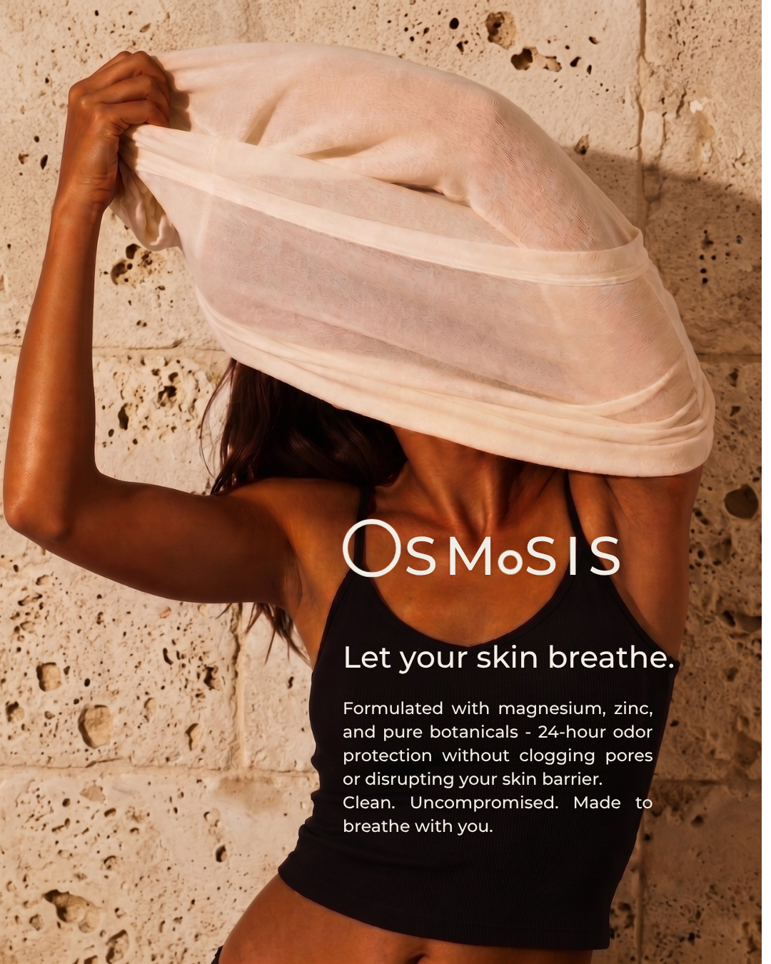
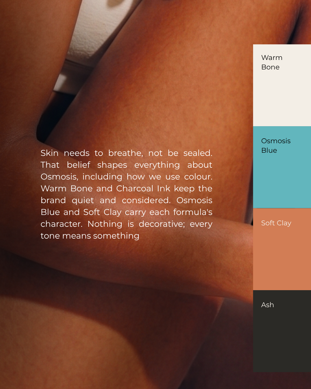
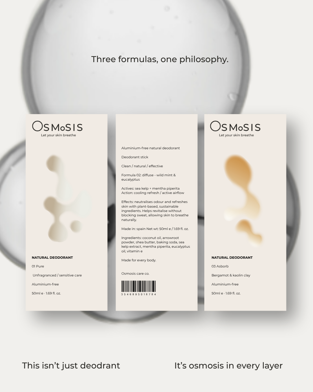
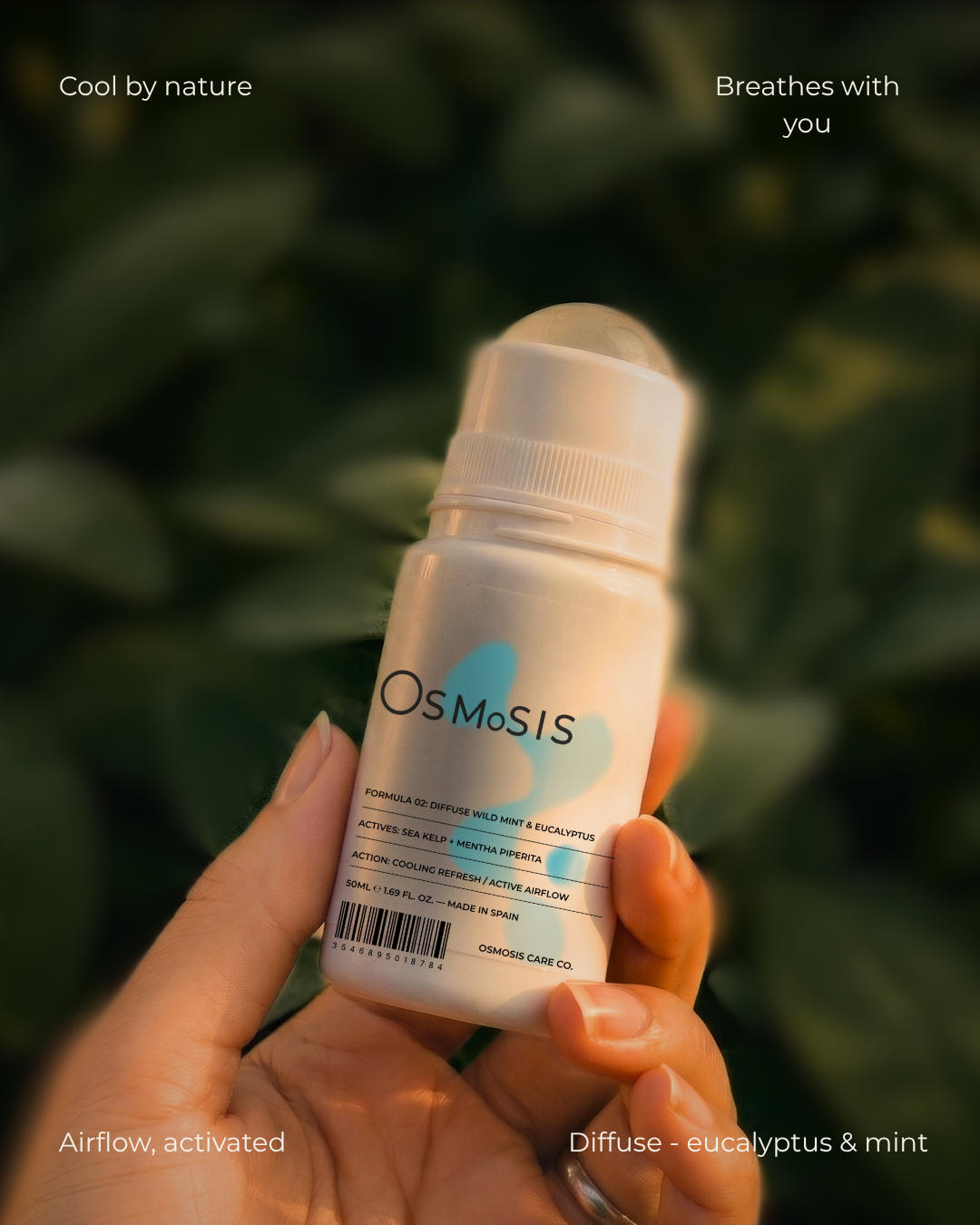
The wordmark plays on the brand's own idea - "OsMoSIS," lowercase letters breaking up the form to suggest air moving through it, permeability built into the logo itself rather than just claimed in copy. The palette (Warm Bone, Osmosis Blue, Soft Clay, Ash) stays quiet and considered, each tone tied to a specific formula rather than used decoratively. Photography leans warm and skin-forward - sunlight, water, close crops on the body - keeping the brand tactile and human rather than clinical, which is where most deodorant identities default.
DELIVERABLES
Brand Identity - wordmark, colour palette, typography
Packaging - bottle design, box, two formula variants
Campaign - editorial poster series, lifestyle photography