SAN CAPRI
THE BRAND
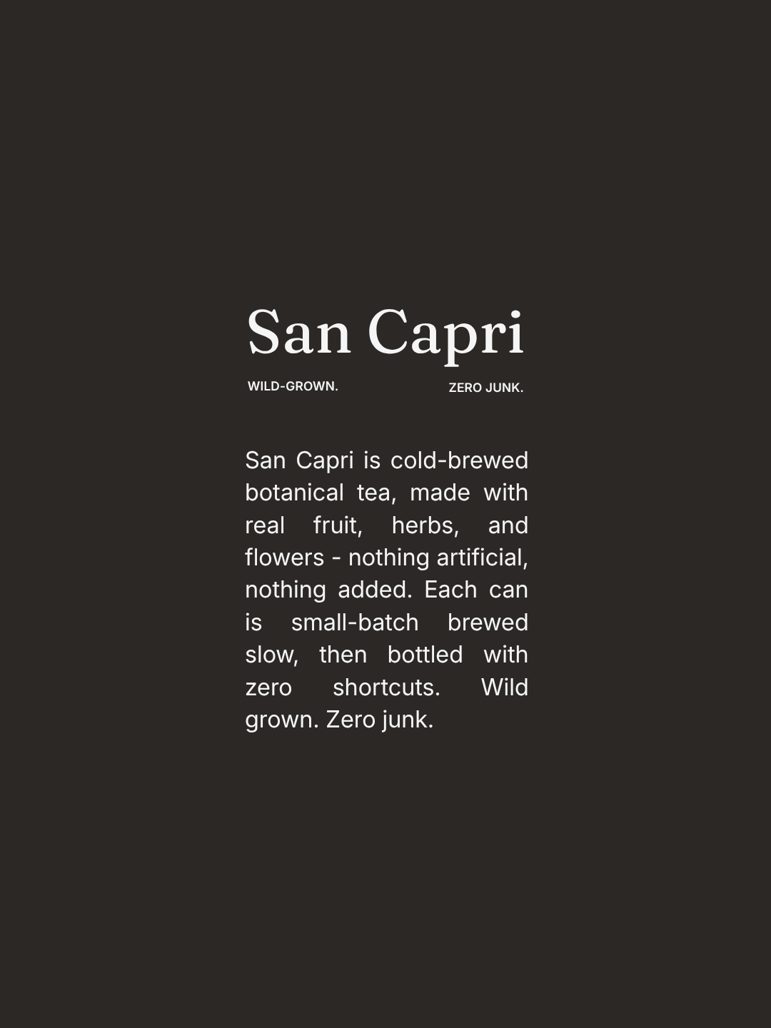
San Capri is a cold-brewed botanical iced tea - quiet, editorial, and Mediterranean in spirit rather than tropical. Built around restraint rather than saturation.
THE BRIEF
Design a brand identity and packaging for San Capri, a craft iced tea made with organic leaves, wild floral infusions, and zero artificial junk - cold-brewed to perfection, made for garden picnics and anyone wanting a healthy cold drink that tastes like summer. Keywords: Botanical, Sun-Drenched, Natural, Vibrant.
SOLUTION
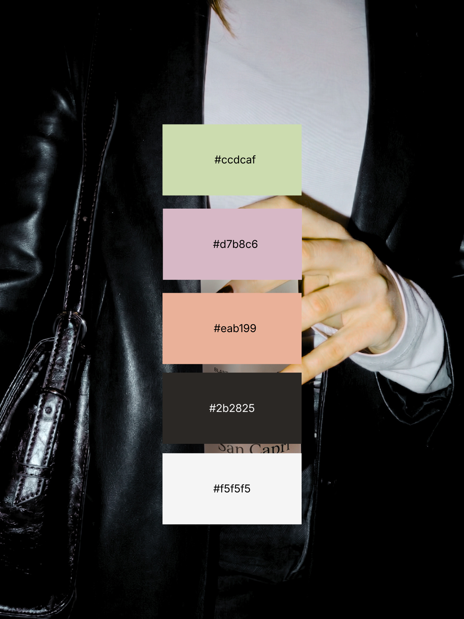
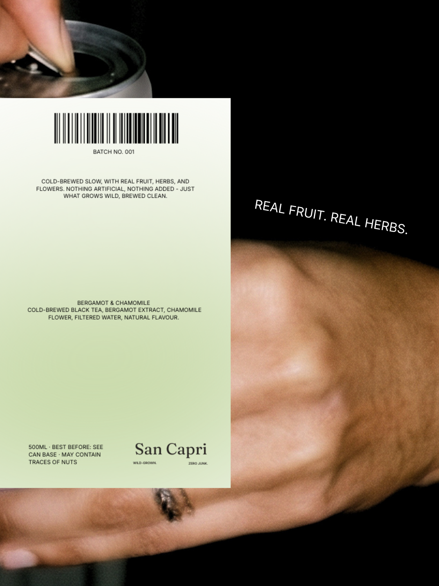
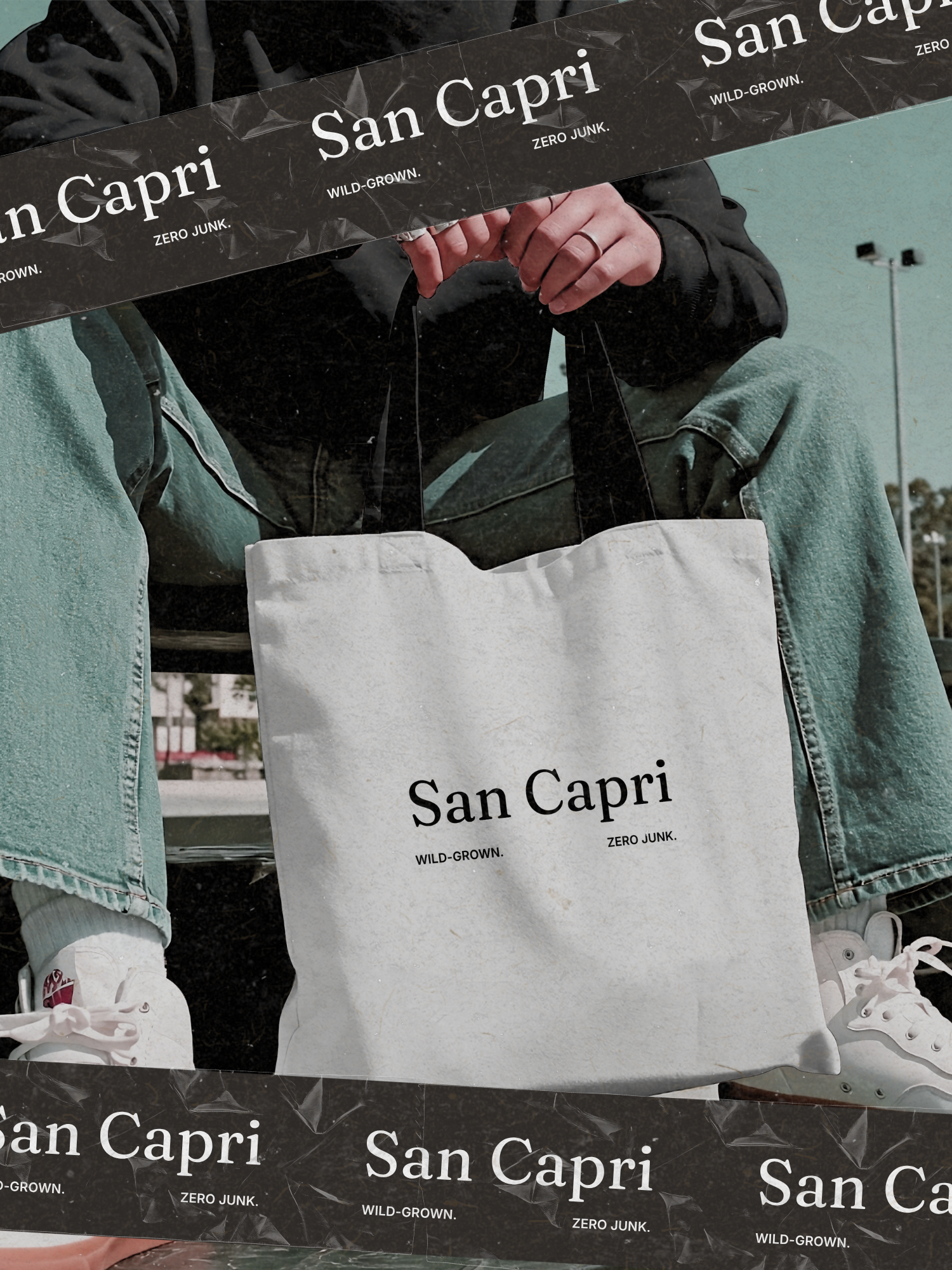
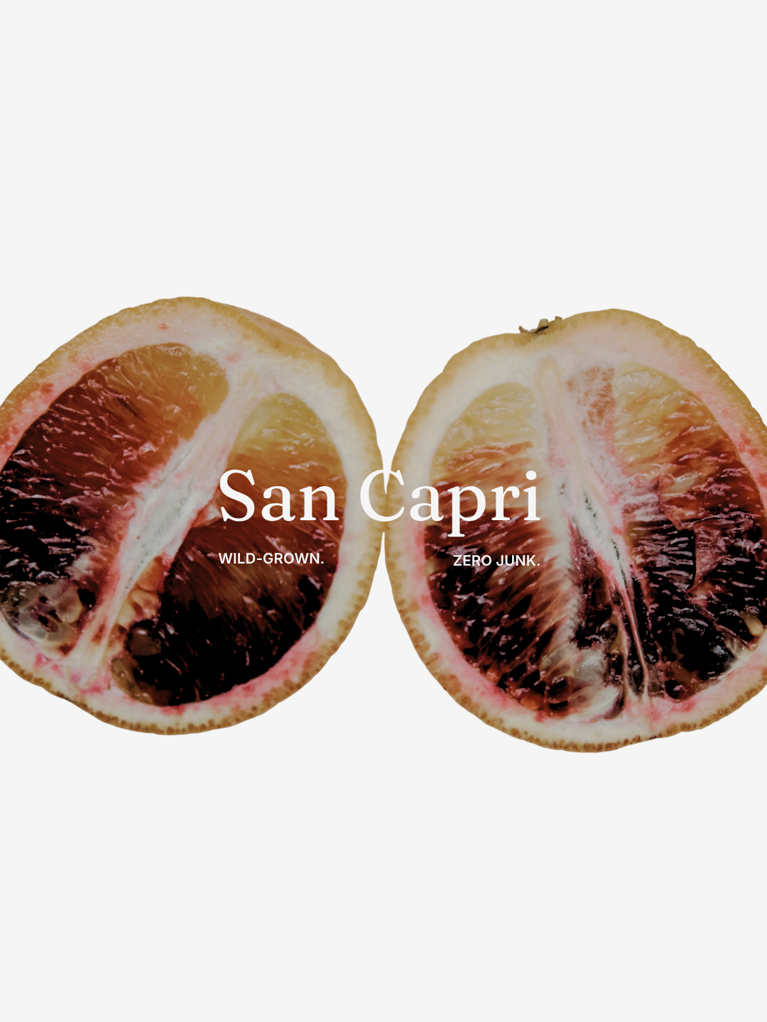
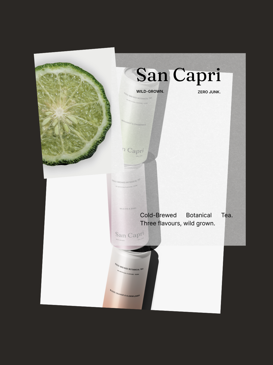
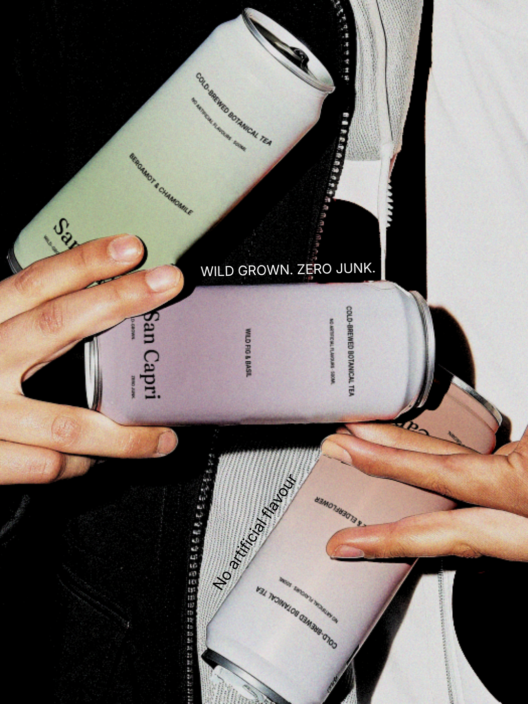
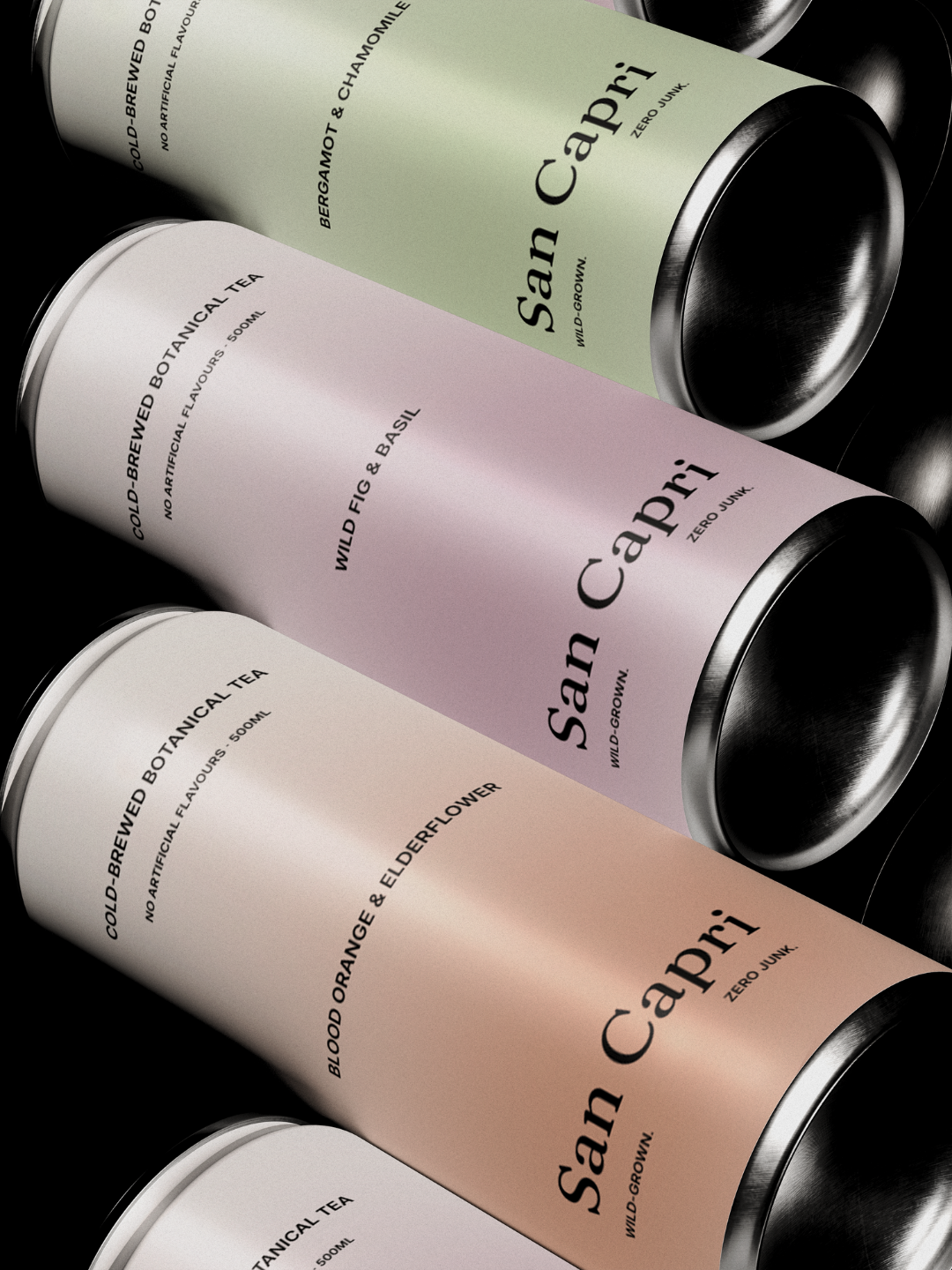
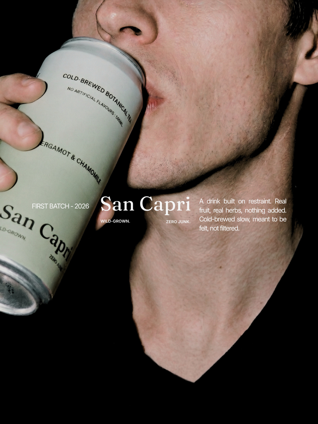
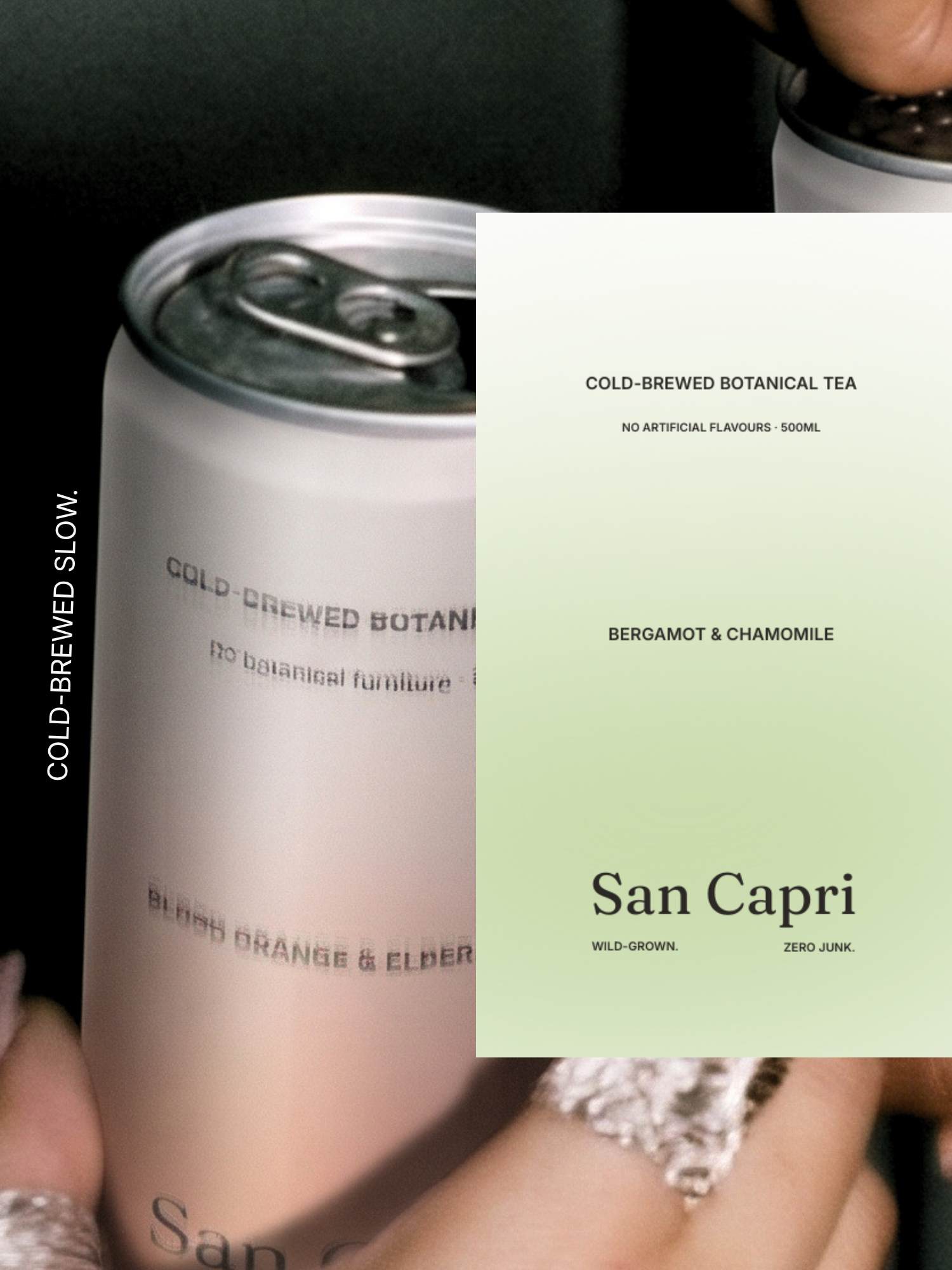
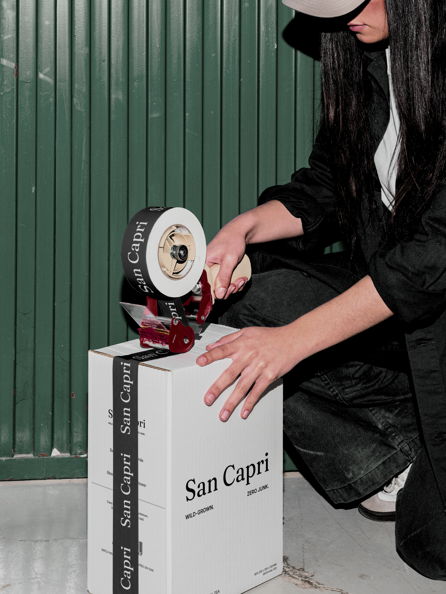
Wild-Grown. Zero Junk. A Fraunces serif wordmark (Regular weight, tightened tracking) anchors each can, paired with Inter/General Sans small-caps detail text - the same restrained two-typeface discipline used across the rest of the range. Each flavour is distinguished by a soft, tonal gradient fading from Capri Cream into one muted accent - Moss, Dusty Plum, or Terracotta - quiet and controlled rather than the saturated, edge-to-edge gradients other entries in the challenge used. A single-line citrus blossom submark, kept off the can face and reserved for social/stamp/merch use, ties the range together without cluttering the label. Campaign direction avoids beach/lifestyle clichés entirely in favour of moody, editorial studio photography -hard directional light, dark backgrounds, botanical ingredients (fig, blood orange, elderflower) used as styling rather than props.
DELIVERABLES
Brand Identity - logotype (Fraunces), colour system, typography
Can Packaging Design - three flavour variants, 250ml
Tagline & Copy System - "Wild-Grown. Zero Junk." plus scattered campaign phrases
Campaign Photography Direction - moody editorial styling, ingredient-led compositions
(In progress) Final flavour can artwork, submark refinement, campaign image compositing