
DOWN BAD DENIM CO.
THE BRAND
Down Bad Denim Co. is a small-batch denim label built around statement pieces - expressive, hand-finished, and made for people who’d rather stand out then blend in.
THE BRIEF
The brief called for a full brand identity for a denim label rooted in Y2K-influenced maximalism, reinterpreted through a modern, unisex lens. Deliverables spanned brand identity, garment labelling, packaging, campaign assets, and additional touchpoints - all built around a collection of statement pieces finished with embroidery, embellishment, custom hardware, and unexpected detailing.
SOLUTION
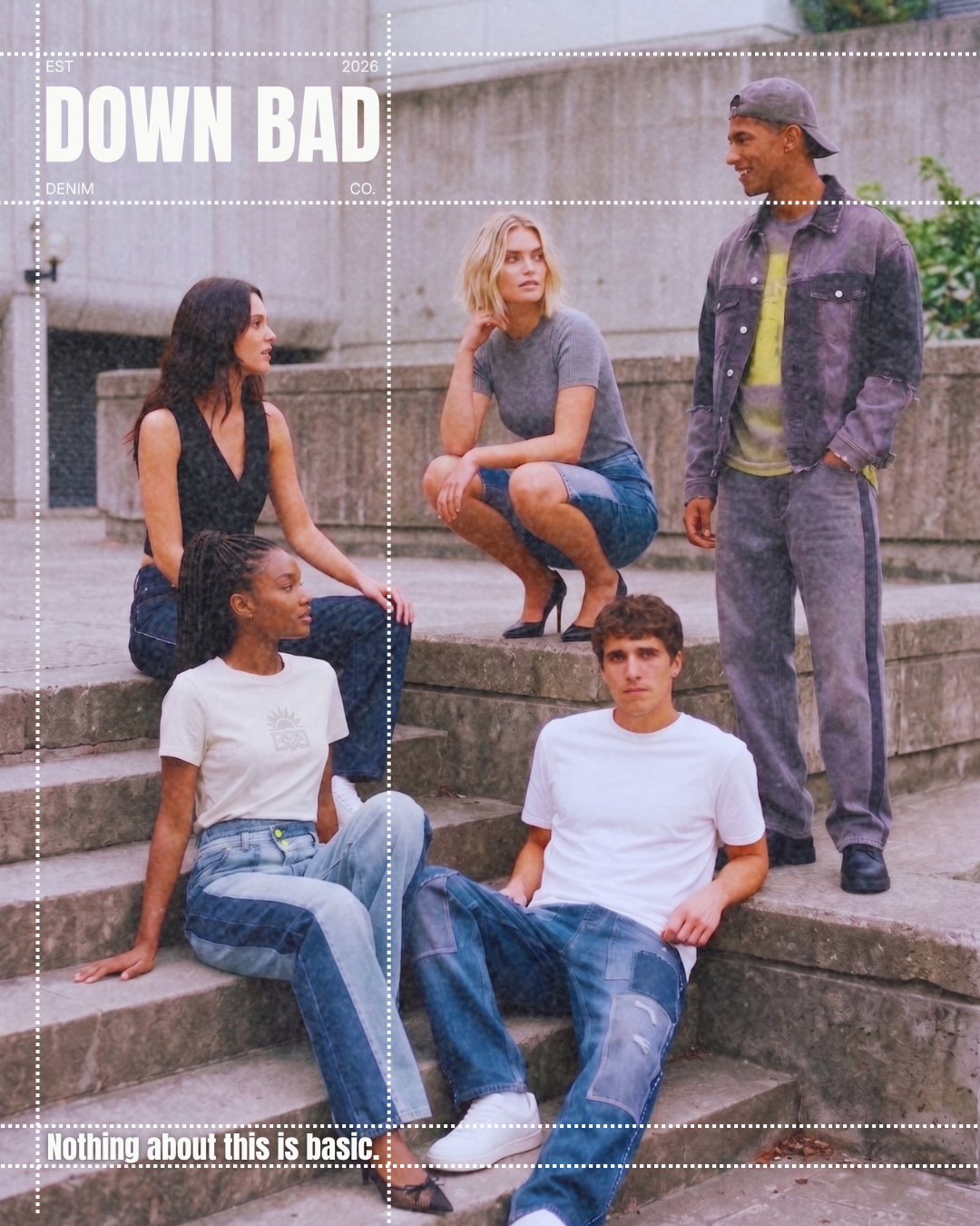
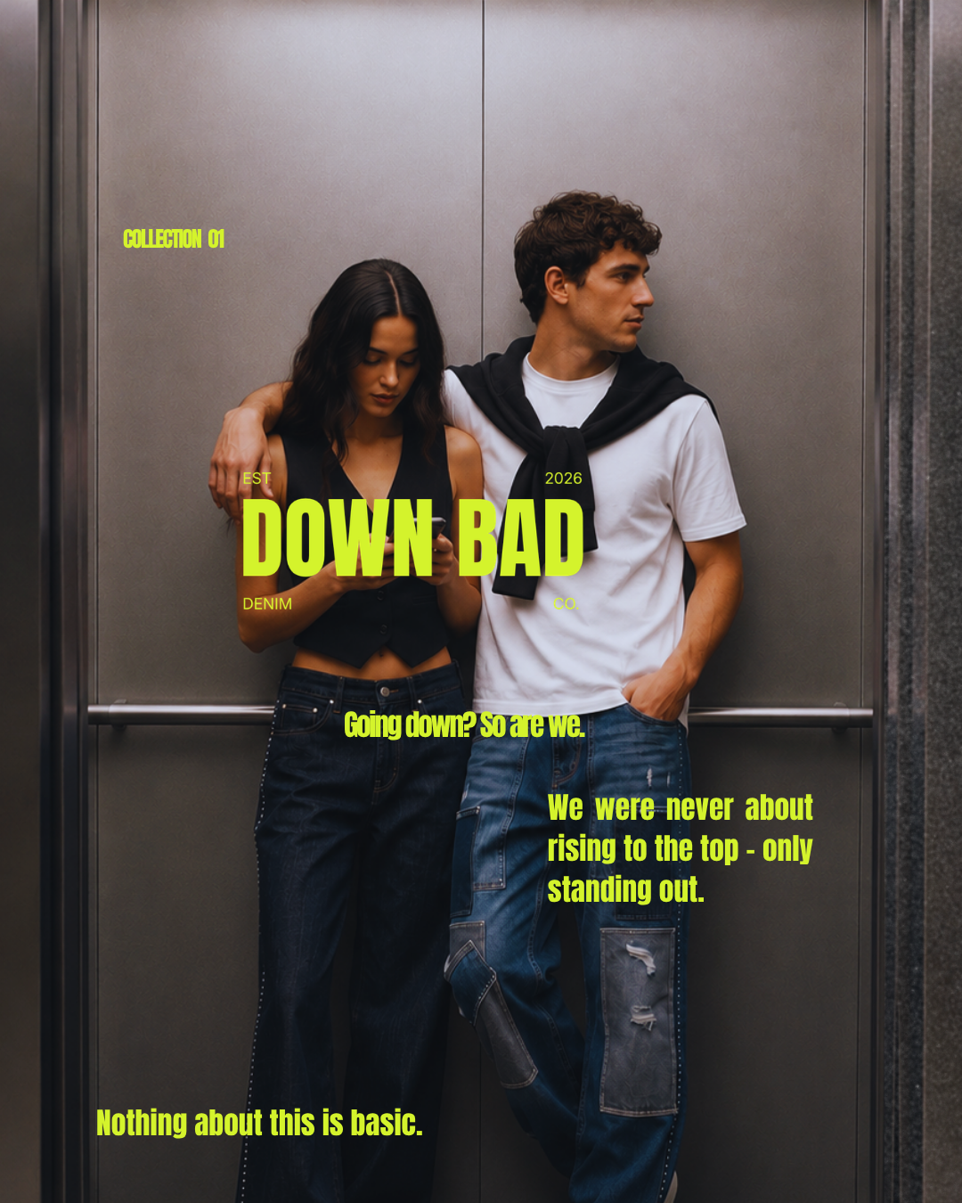
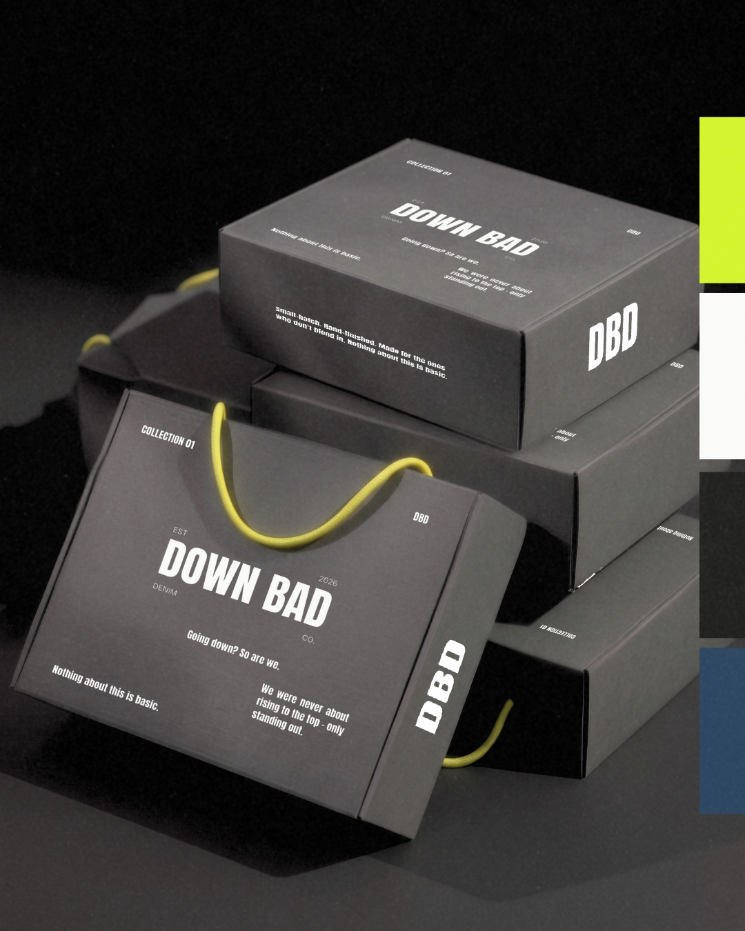
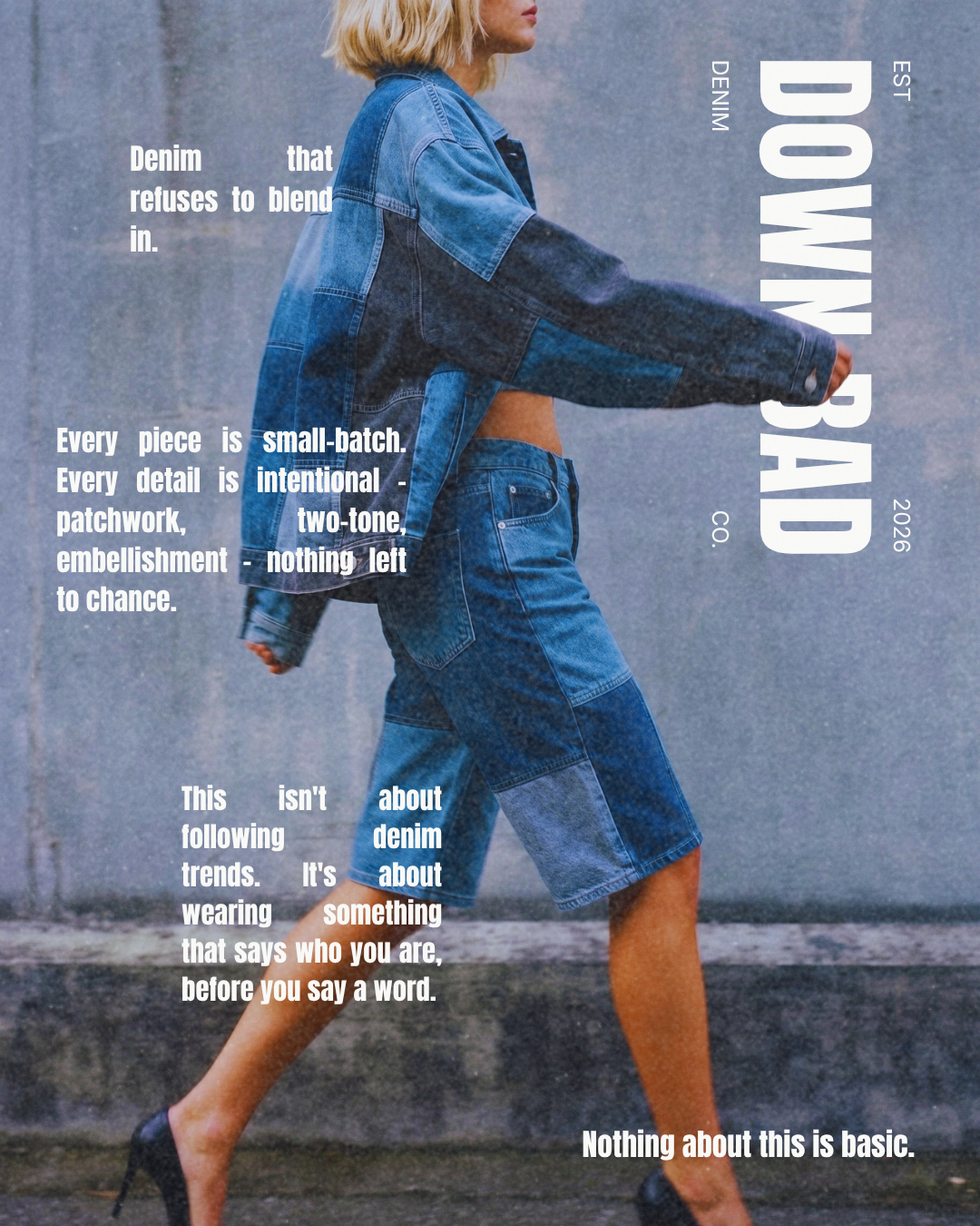
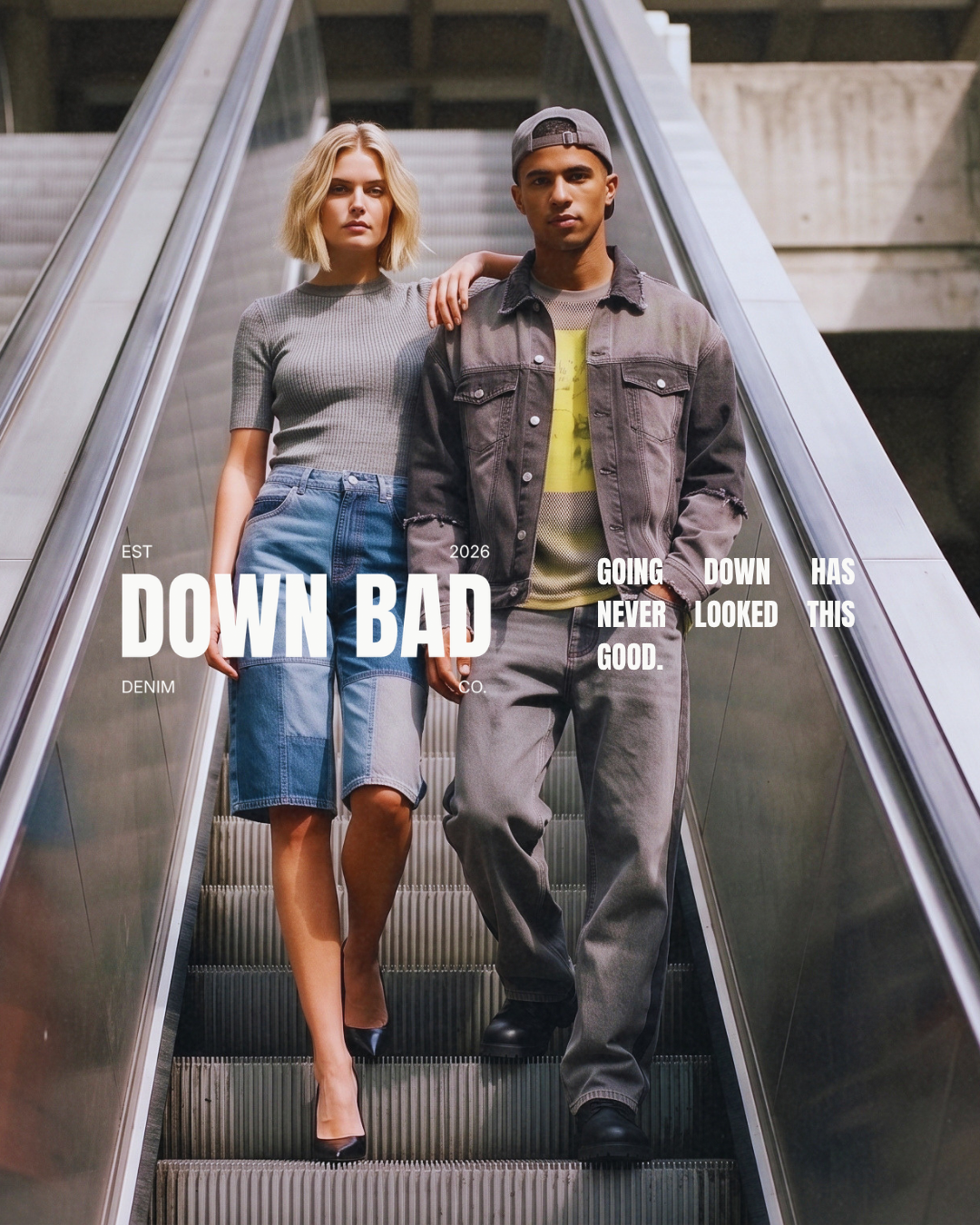
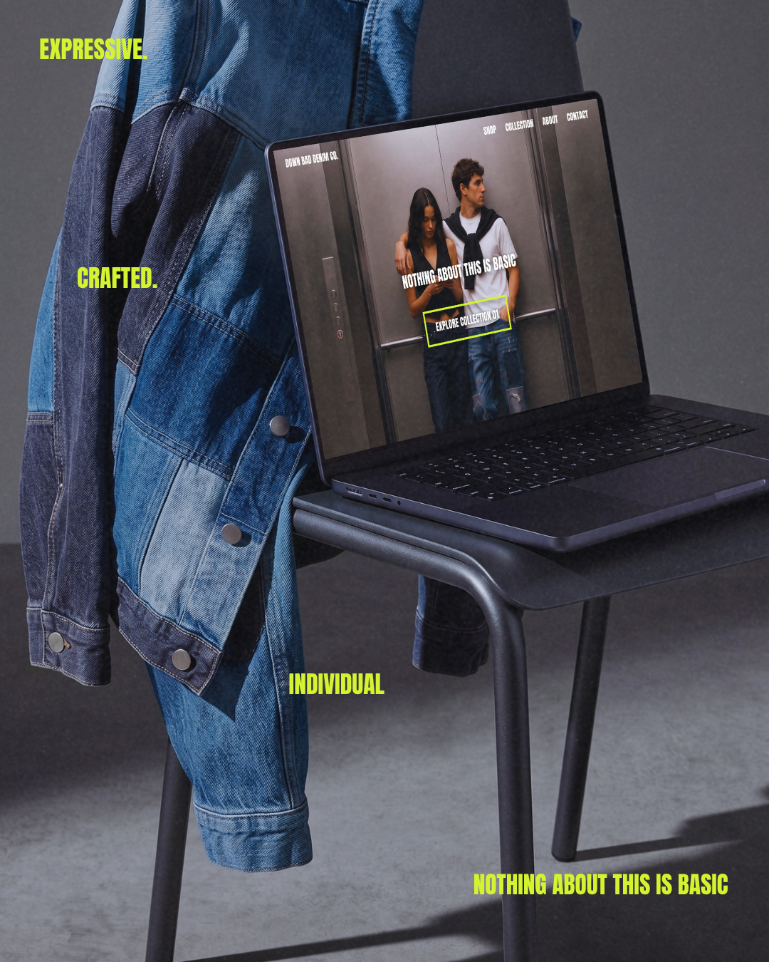
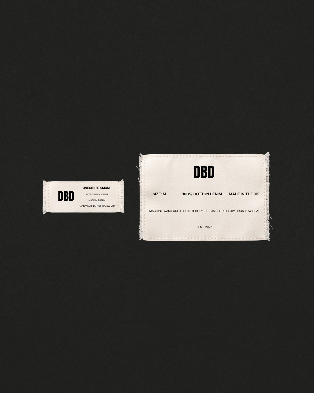
The identity centres on a bold, condensed wordmark in Anton, framed by a four-corner lockup (EST / 2026 / DENIM / CO.) with a DBD monogram carrying the brand into smaller applications like labels and caps. The palette stays disciplined - Denim Blue, Charcoal, and White as the base, with Lime Yellow held back as a single loud accent so it reads as a surprise, not decoration. That restraint runs through the whole system: one rhinestone seam, not an embellished garment. The brand name itself became a visual motif too - descending movement threads through the campaign film and hero imagery, tying "Down Bad" back to its literal meaning.
DELIVERABLES
Brand Identity - wordmark, monogram, four-corner lockup, colour palette, typography
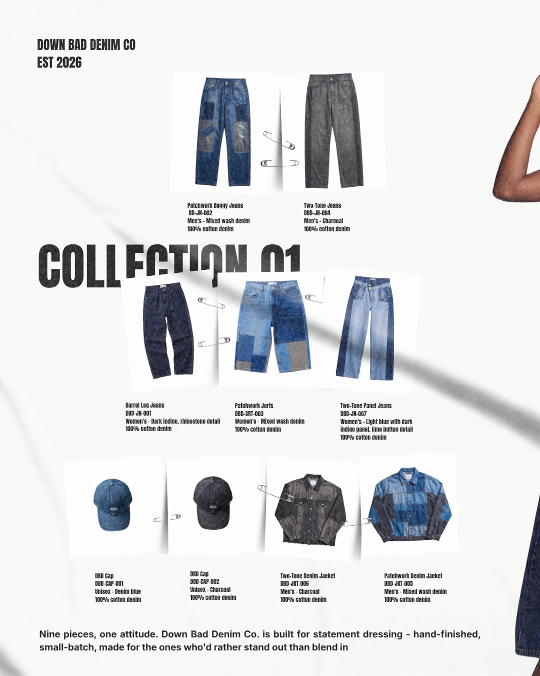
Collection - nine pieces across womenswear, menswear, and unisex, each with its own construction detail (rhinestone seam, patchwork, contrast panelling, lime hardware)
Packaging - kraft/charcoal box system with lime yellow draw string handles, stamped exterior branding
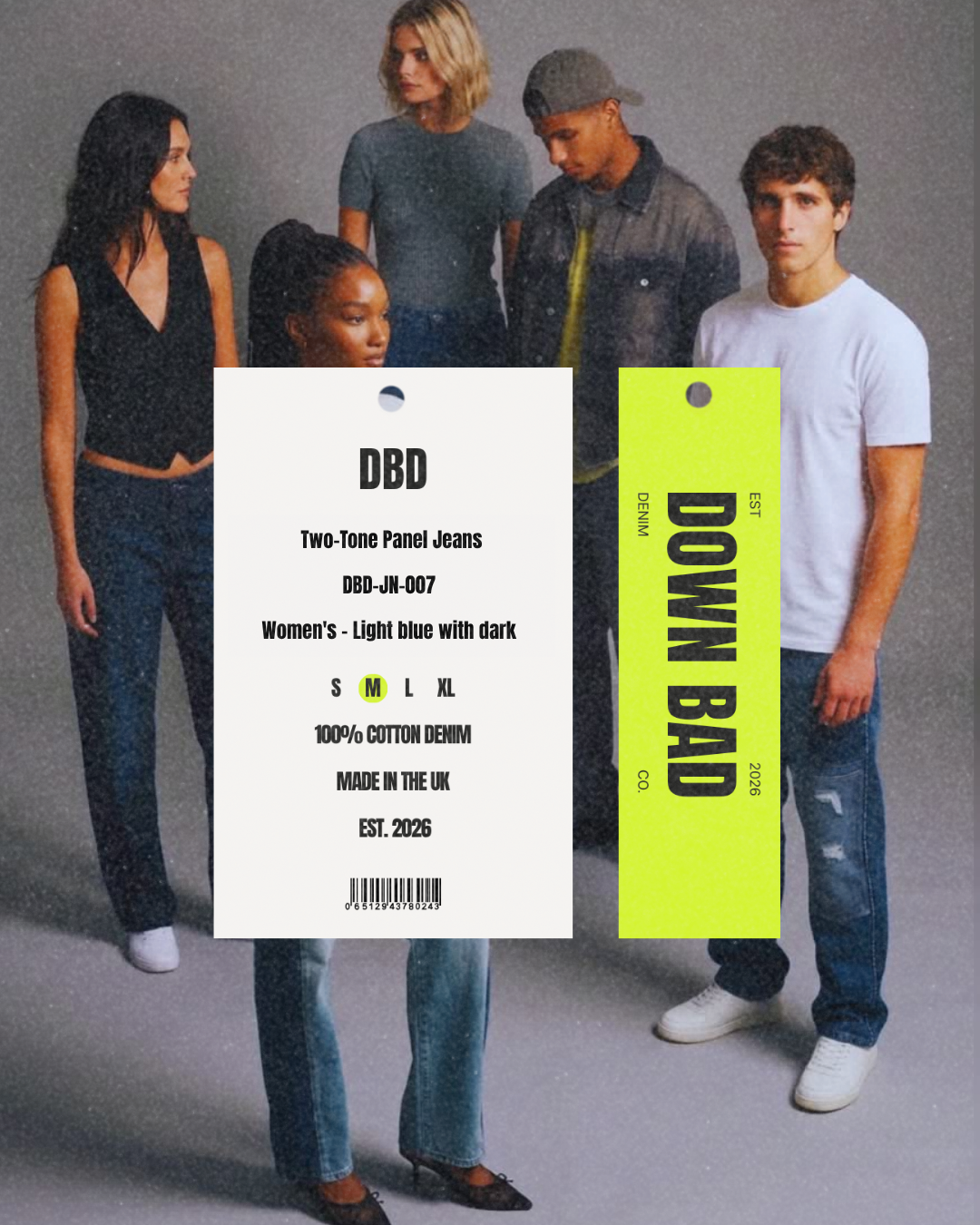
Labelling - two-tier hang tags, garment labels in two sizes
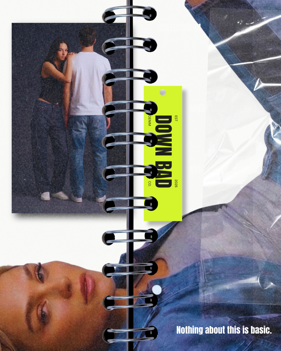
Campaign - editorial photography, teaser film, lookbook/archive spread, magazine-style collection page, closing "brand in the wild" website moment