PALOMA
THE BRAND
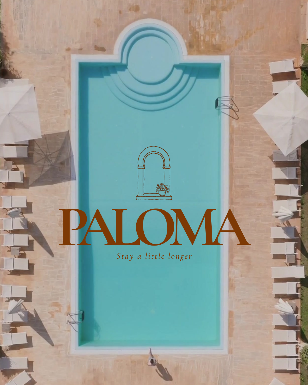
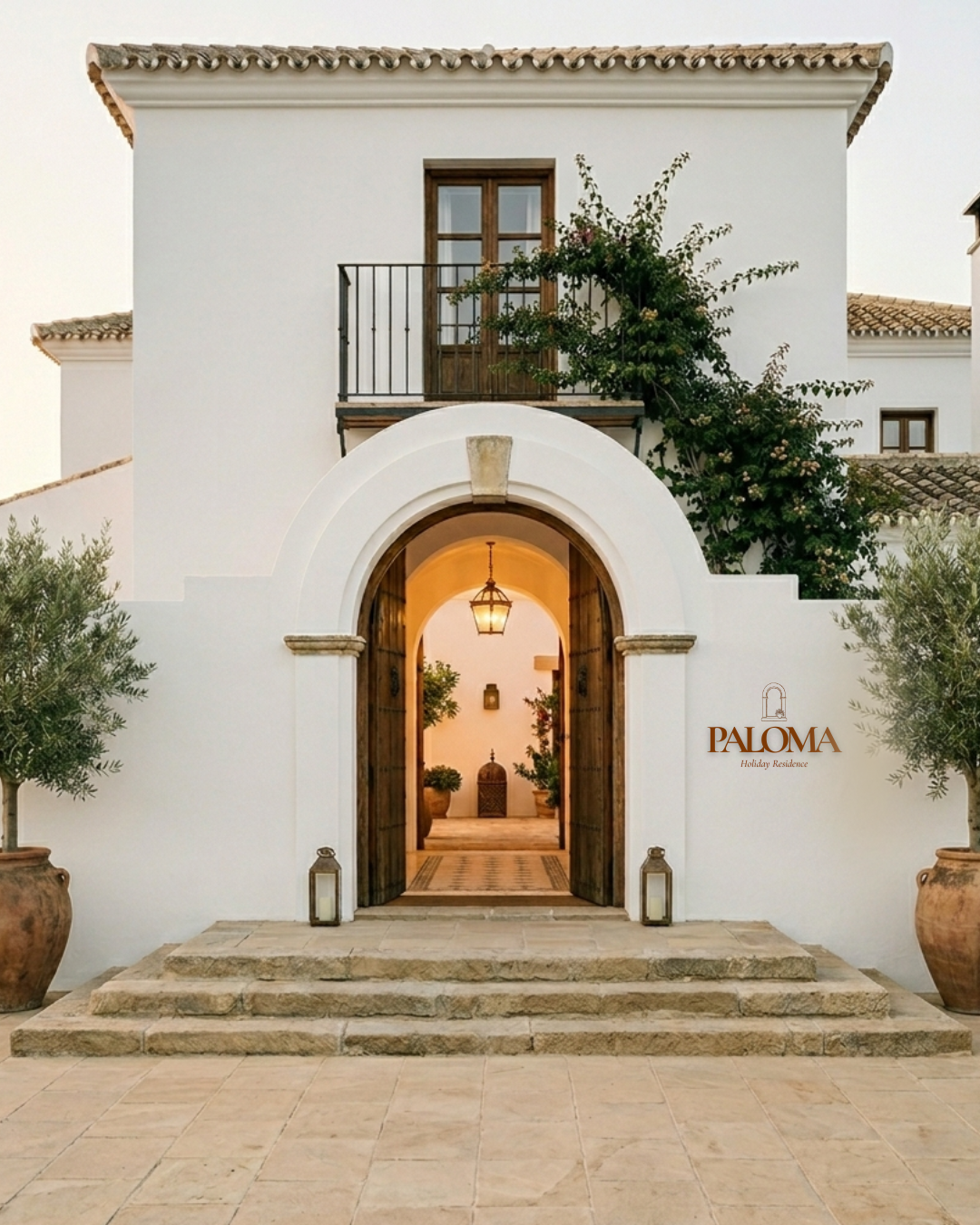
Paloma is a Mediterranean holiday residence designed as a calm retreat between sea, sun, and slow living. It feels relaxed yet refined, offering guests a sense of escape rooted in simplicity, light, and coastal ease.
THE BRIEF
The brief called for Room Keys & Branding for a holiday residence, with keywords Mediterranean, Calm, Warm, Refined.
SOLUTION
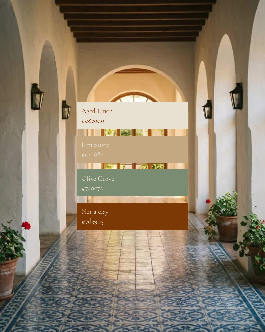
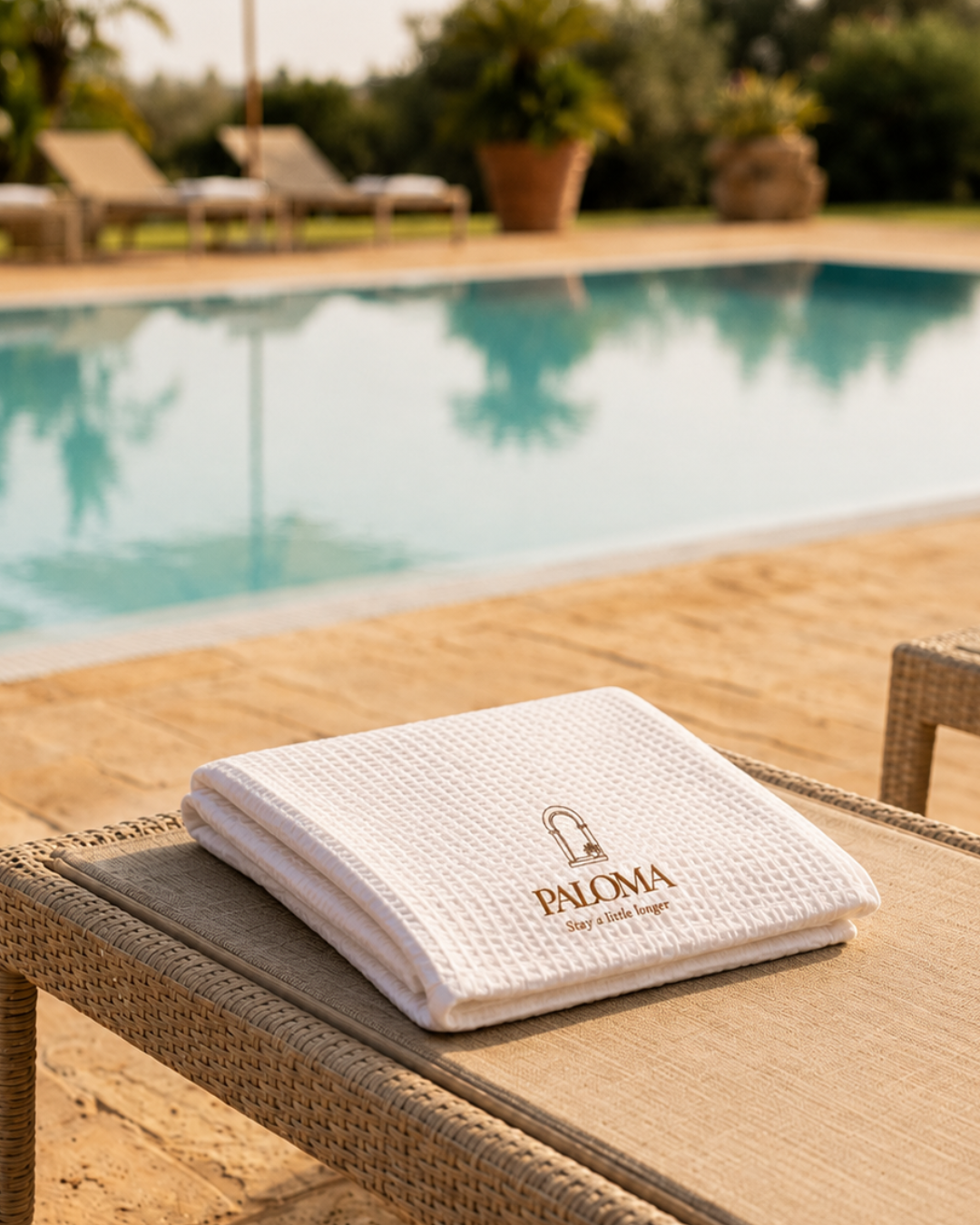
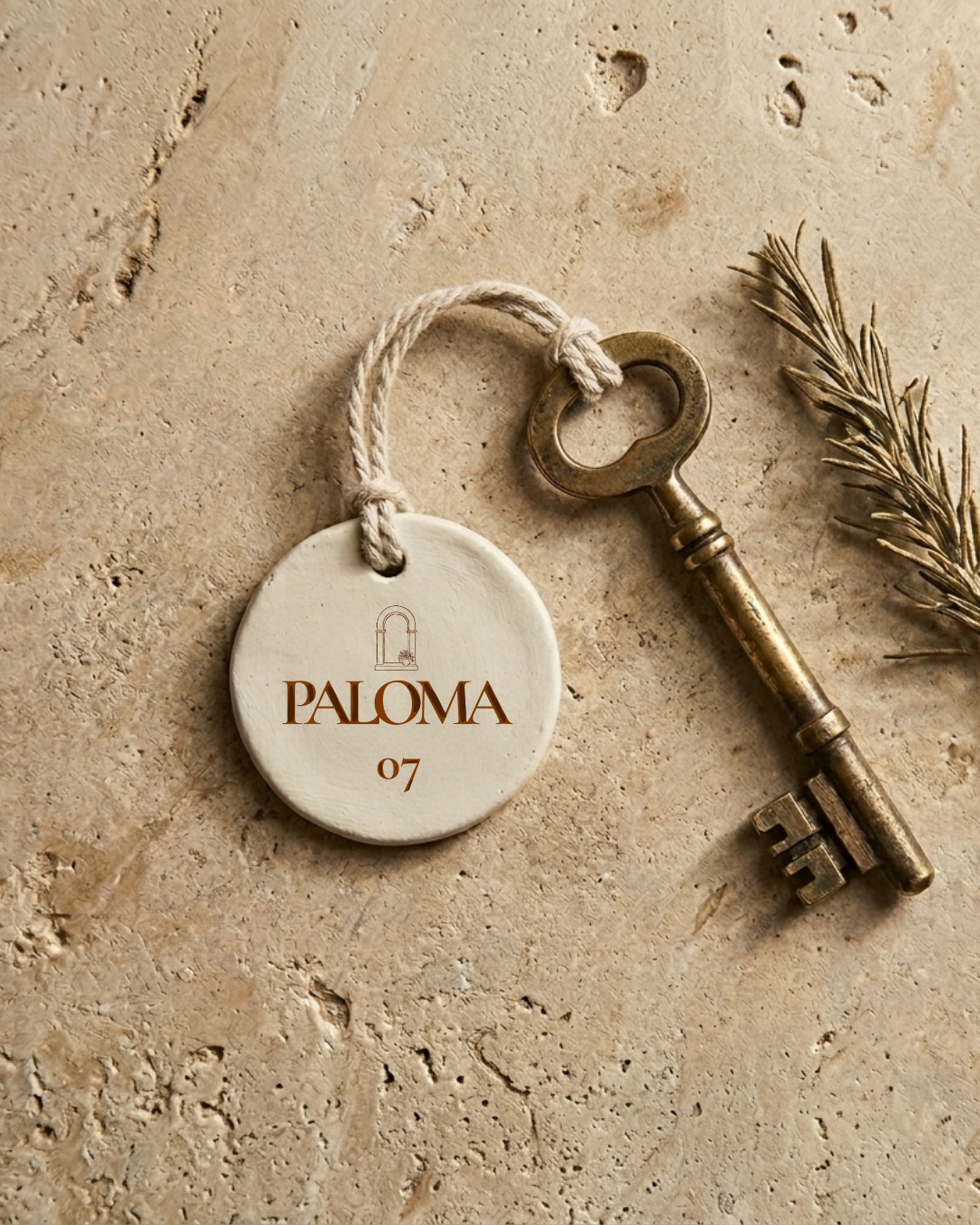
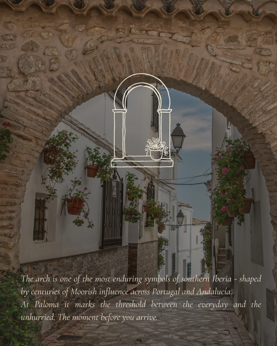
The identity blends Spanish and Portuguese influence into something quietly architectural rather than decorative - a Moorish horseshoe arch submark, rendered in a fine, ink-sketch line, sits alongside the Paloma wordmark in small caps, warm and personal rather than corporate. The palette of aged linen, warm stone, deep sage, aged brass and faded terracotta carries that same slow, sun-worn warmth across every touchpoint, right down to the weight of the room key in your hand.
DELIVERABLES
Brand Identity - logo, submark, colour palette, typography
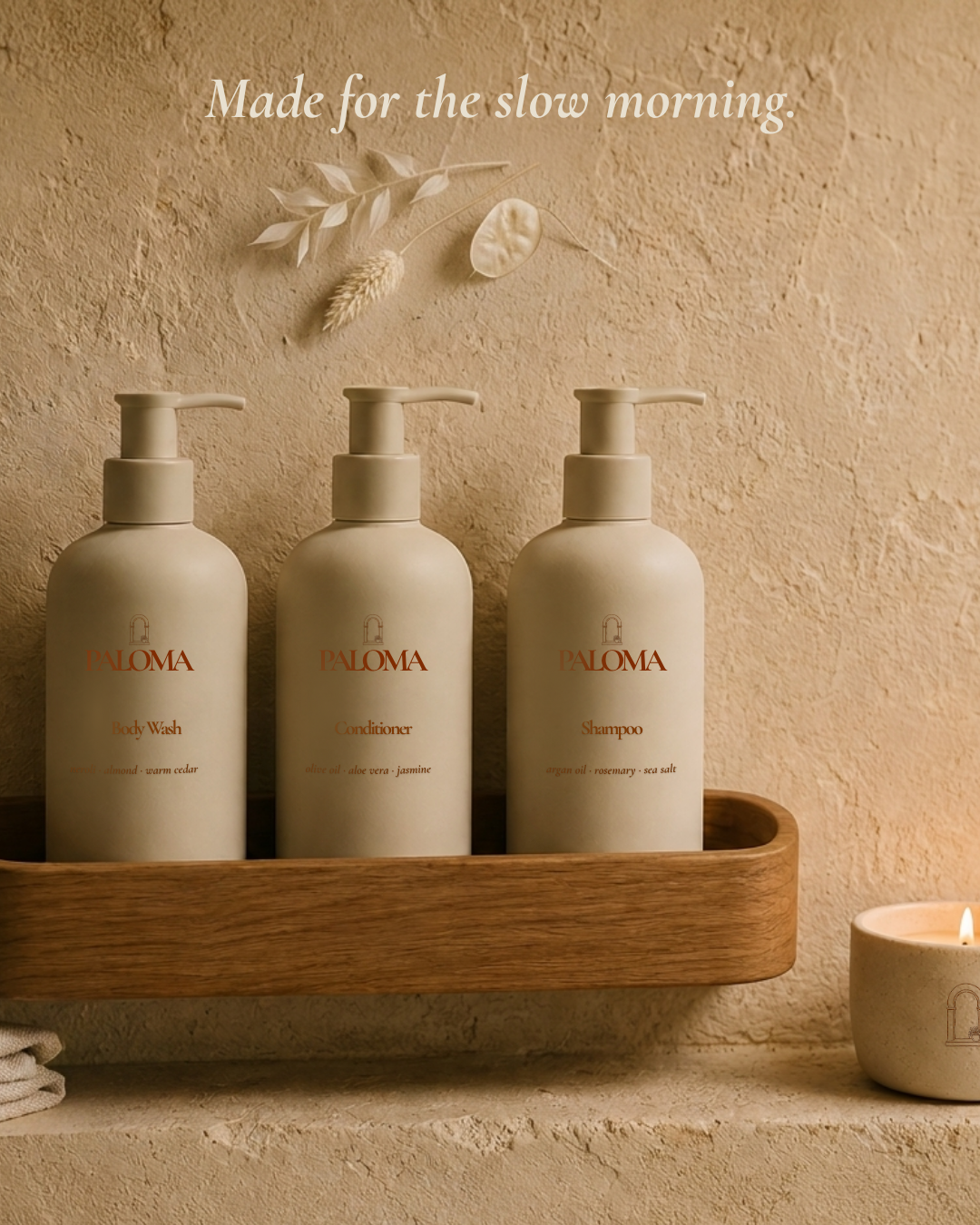
Guest Amenities - room key, robe, flip flops, toiletries
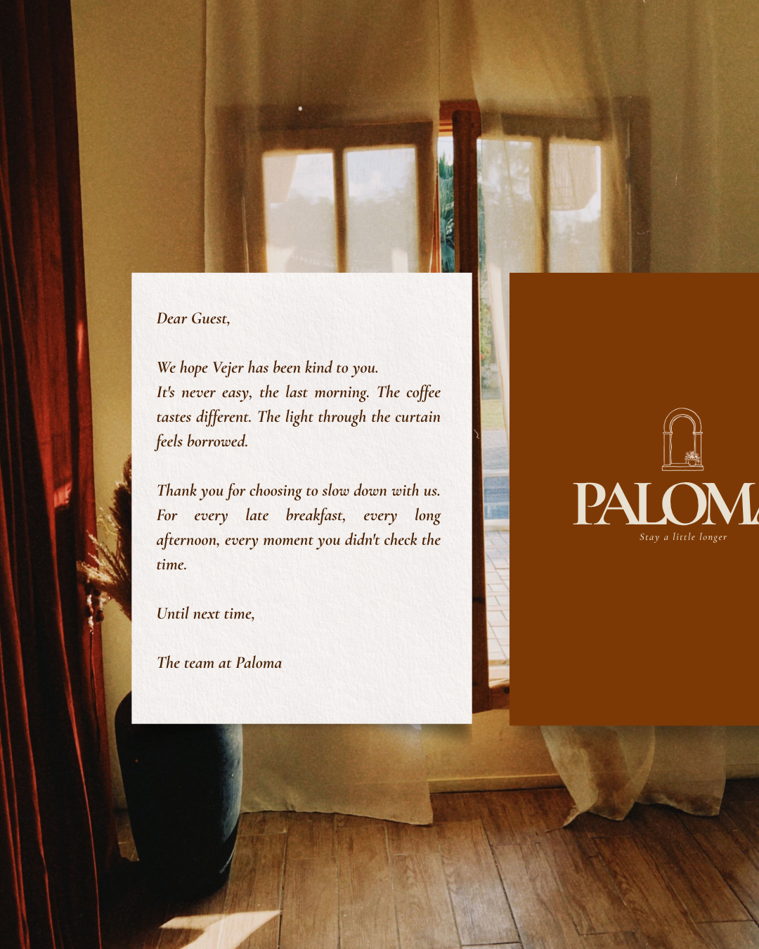
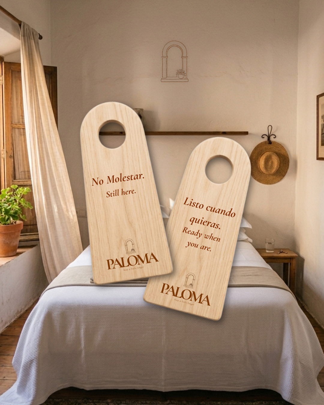
Collateral - matchbook, poolside drinks menu, towel, do not disturb signs