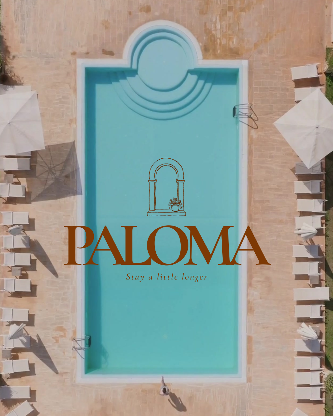
PALOMA
Paloma was not built to impress.
Paloma was not built to impress. It was built to make you stay.
A Mediterranean holiday residence rooted in slow living, founded in 1989 by a Portuguese and Spanish couple who couldn't choose between two coastlines. So they brought both together. Nestled above the old town of Nerja, Andalucía - where the mountains meet the Mediterranean and the streets are too narrow to rush.
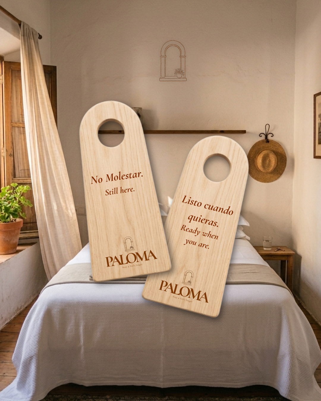
The identity built around Cormorant Garamond light weight in small caps - quiet, refined, unhurried. The arch submark, a fine line illustration of an Andalusian doorway, drawn from centuries of Moorish influence across southern Iberia. The palette — Aged Linen, Limestone, Olive Grove and Nerja Clay.
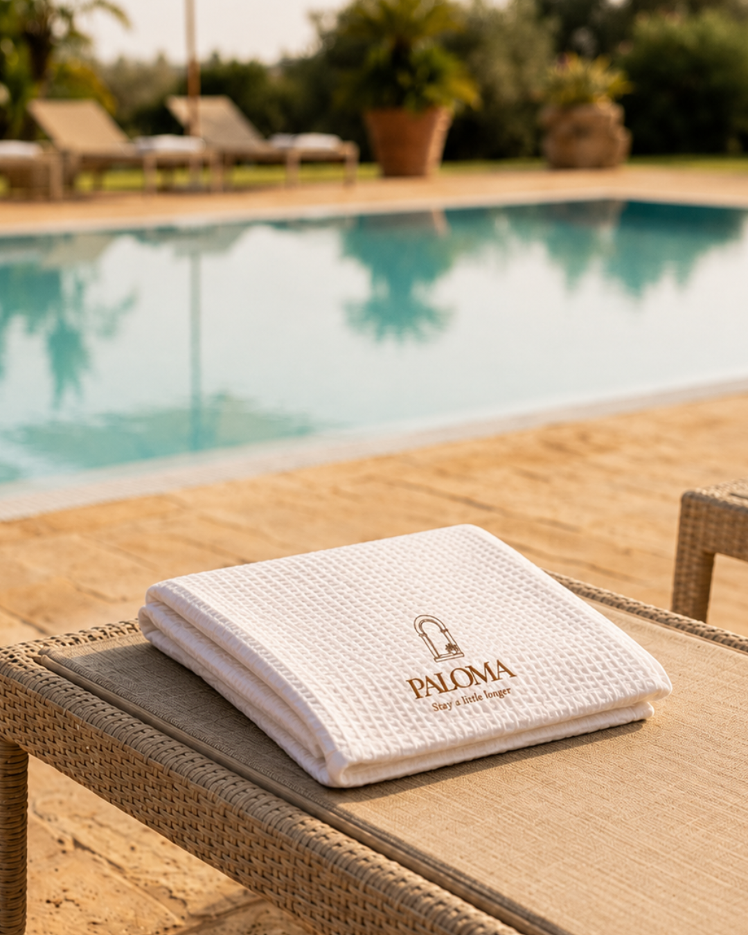
Deliverables spanned the full guest experience - room key with hand thrown ceramic tag, toiletries set, poolside towel, wooden do not disturb sign, hotel entrance signage, goodbye letter, welcome tray and a complete campaign image system.
Brand identity - logo, submark, colour palette, typography, packaging, signage, key design, collateral, campaign